Empty Nester Kitchen Renovation
Regional Award Winner KDC 2010-12
My clients decided to renovate their kitchen for their new empty-nest life. The old kitchen design was fine for raising children, but not for their new empty-nest life. The problem was the lack of connection to the Great Room for daily living, entertaining and dining. The old kitchen’s peninsula was not optimal adult dining and conversation.
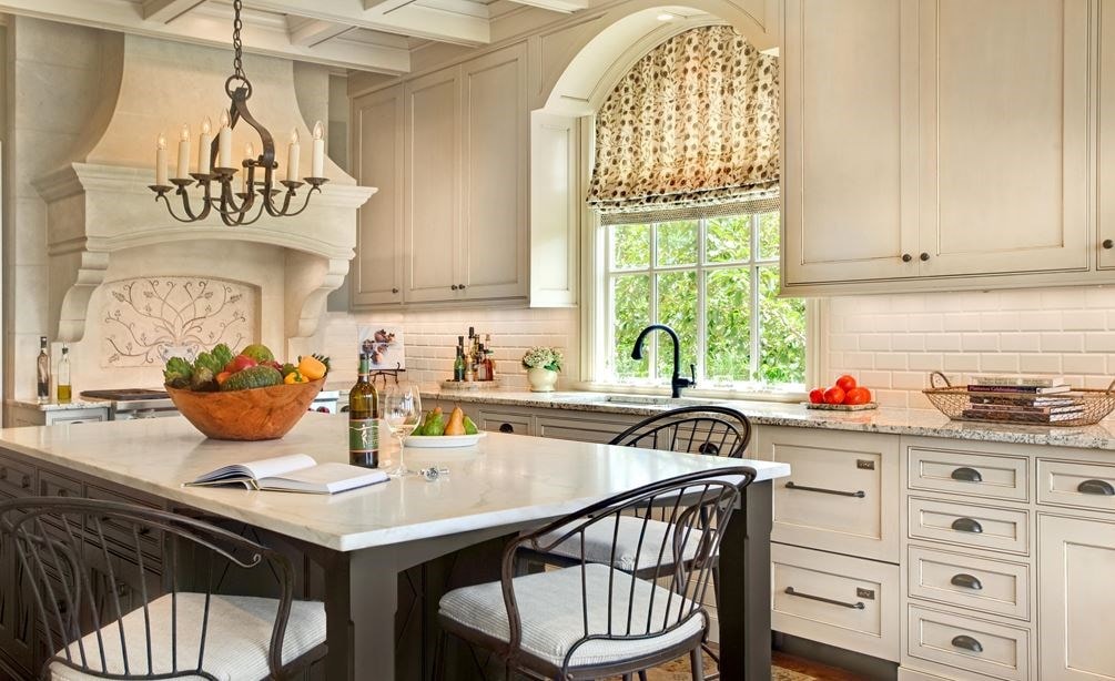
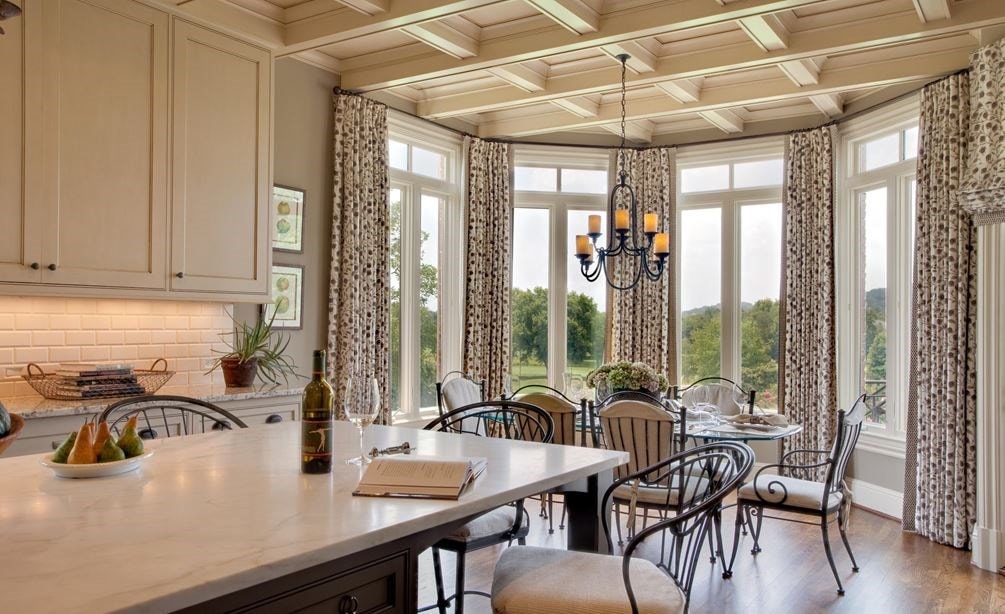
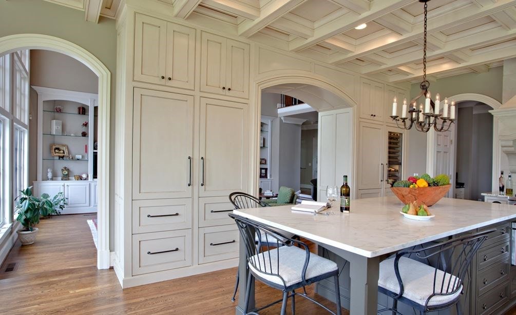
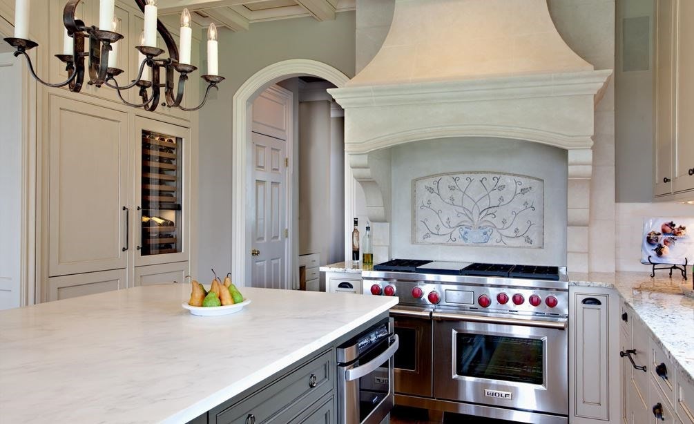
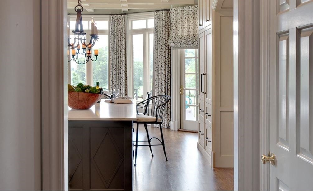
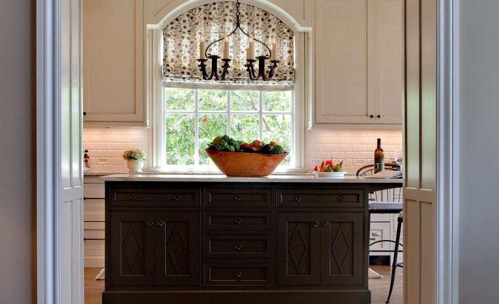
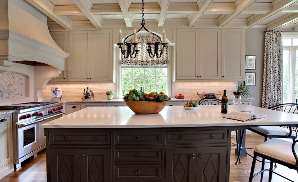
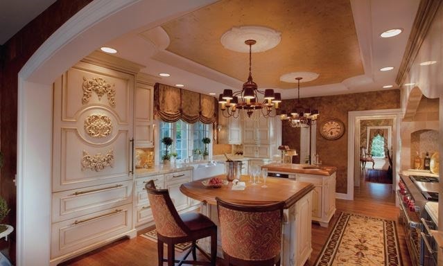
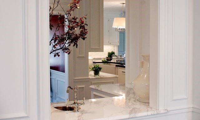
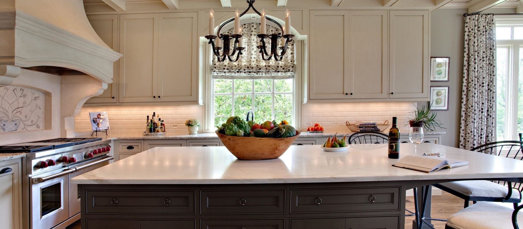
The design solutions for this renovation included the following: Created a new arched 6’ opening between the Kitchen and Great Room (also moved the existing 3’ cased opening down 6” to not feel so cramped in the corner, and arch to match the existing arched cased opening from the butler’s pantry hall). The radius of the existing arch was repeated in the new and modified openings to the Great Room. Repetition of arches created harmony in the space. A new 9' island was placed so the first 6' centered on the new opening, antique chandelier, and window, creating a pleasing symmetric view into the new Kitchen. The 3' end section of the island forms an intimate dining opportunity for up to three. Recessed pin lights above pool softly on the Calcutta Gold Marble island top for dining. The work triangle was moved to the far end of the kitchen to channel social circulation and interaction at the dining end of the kitchen. This design made it more conducive for the cook to work while interacting socially in the kitchen.
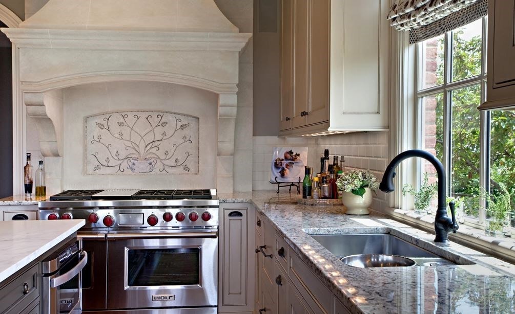
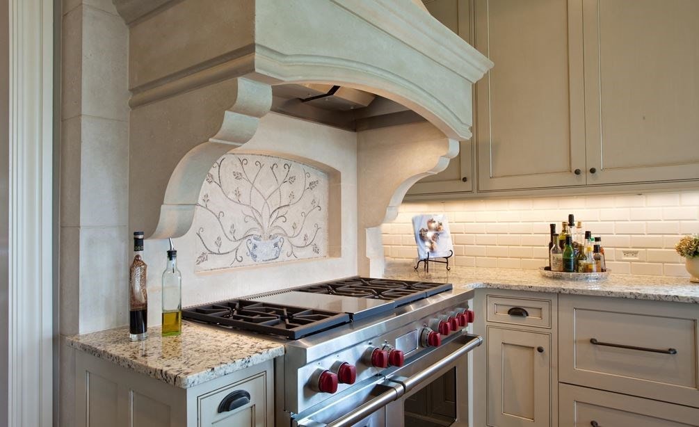
In addition, a 48" Wolf range paired with a Scagliola Stone hood and wall became the focal point of this design. The Sub-Zero 27" Integrated refrigerator and wine storage with drawers were balanced by similar cabinetry for pantry and a baking center on either side of the new opening to the Great Room. A coffered ceiling design, finished like the cabinetry visually married the cabinet elevations and created a cozy feel to the 10' ceiling height. Lastly, a custom light fixture for the breakfast bay was designed to compliment the antique fixture used over the island.
One of the design challenges in this renovation was the cabinetry wall of the new opening. Working with the 27" integrated refrigerator and wine storage with drawers brought uniqueness to the design to be mimicked in the pantry and baking center design on the opposing sides of the new opening. This gave rise to hiding the appliances in the cabinetry for a more furniture-like feel, and contributed to the symmetric principles of the design.
In this kitchen
Shop the products featured in this kitchen.
This kitchen does not feature any Sub-Zero products.
This kitchen does not feature any Wolf products.


