Chelsea Townhouse
Regional Award Winner KDC 2013-14
Setting a new standard for townhouse living in Manhattan: A building only 16 feet wide? That was only the most obvious challenge for William Suk of Suk Design Group and owner/designer Bryan Eure, as they embarked on the restoration of a 135-year-old townhouse in Manhattan's vibrant West Chelsea neighborhood.
-
William Suk
DesignersView Profile
"It was in horrible shape," recalls Bryan. "It had been a low-rent apartment building, and had even had squatters living in it at one time. The previous owner was living in London, and had always intended to restore the building, but never got around to it. It had no real kitchen – what there was, mostly just a fireplace, was down in the basement, where the kitchens often were in townhouses of the 1880's, maintained by the staff." Bill recalled, "When I first saw the house, I was mostly concerned about the width. To put this in context, the entire house is the width of two sheets of 4'x8' plywood. Knowing the design goals of Bryan and his partner Bill, we knew the layout of the house would be a big challenge." The structure was failing, and the infrastructure – plumbing, heating, electricity, lack of insulation – was not to code and badly in need of updating. The mortar between the bricks could be scraped out with your fingers. While there were some remnants of ornate interior detailing from a bygone era, most of it was chopped up and damaged when the house was used for multiple families. It would have to be a complete gut job. And since it was in the West Chelsea Historic District, right next to a park, getting the necessary approvals from the New York City Landmark Preservation Commission would not be easy. In the end, it took almost two years to complete the restoration. "We have done larger projects in the past," says Bill, "but this was our most challenging project to date because of how much program we were able to cram into such a small volume."
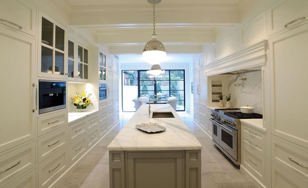
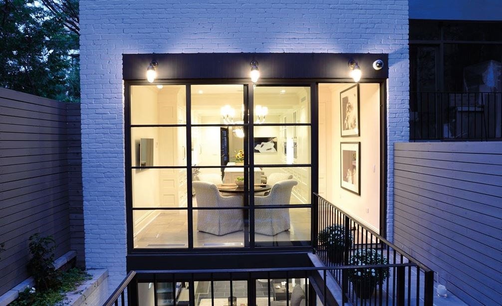
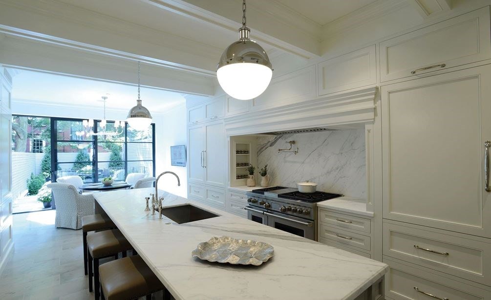
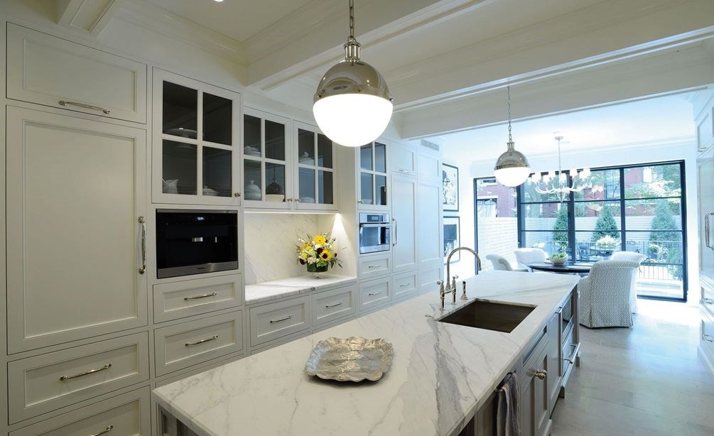
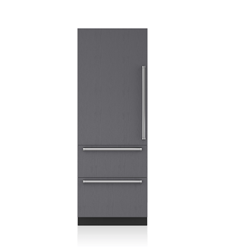
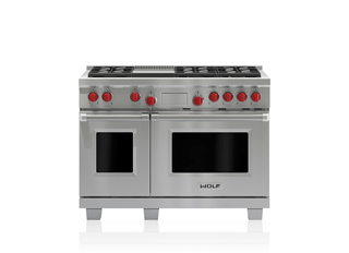
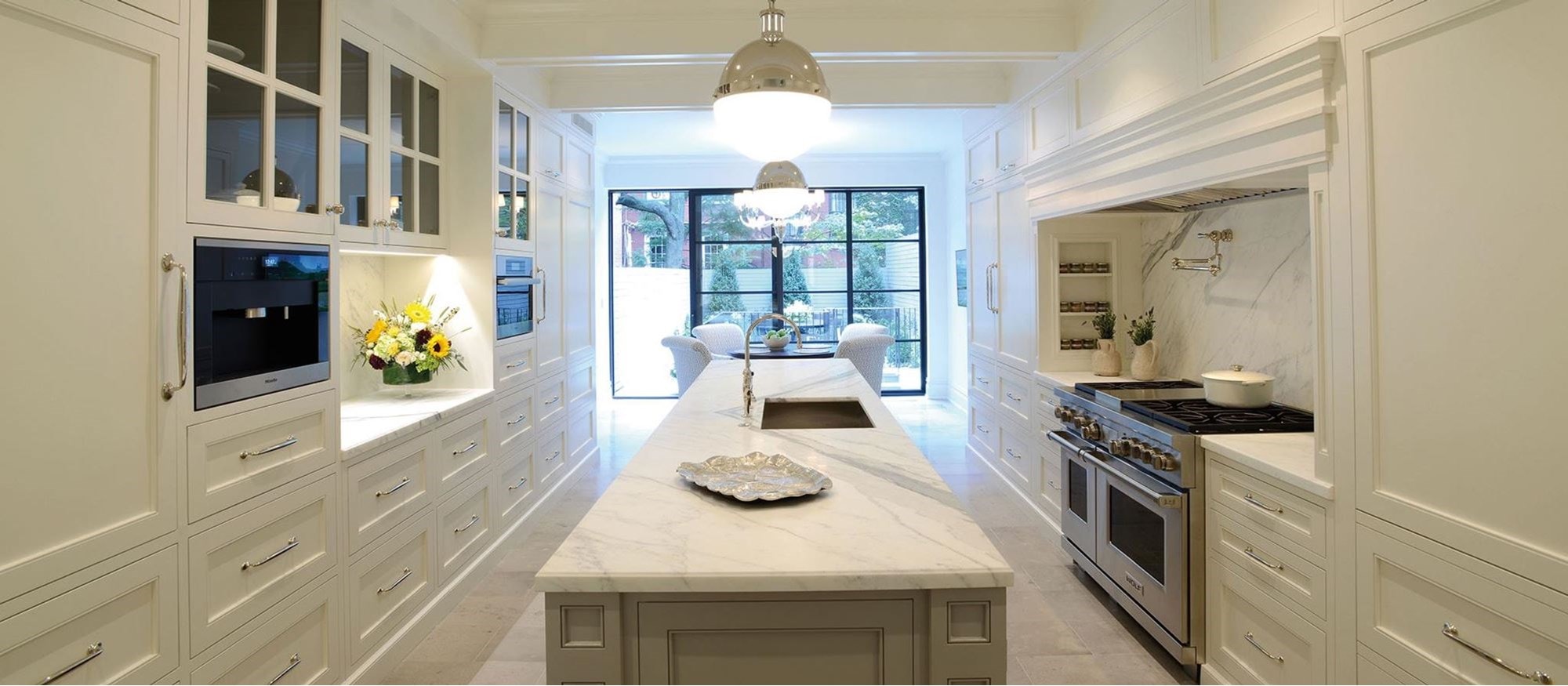
One of the first (and easiest) decisions was to move the kitchen from the basement to the main floor. "The homeowners are avid entertainers," says Bill, "and the primary design goal for the kitchen was to support that function. The layout had to be open, with a large amount of prep space as well as storage for a large collection of china, glassware and serving platters. The kitchen had to be modern in function, yet give a nod to the home's historic past." The only way to deal with the narrow 16-foot width of the house was to create a galley-style layout that allowed free circulation through the kitchen, direct access to the rear
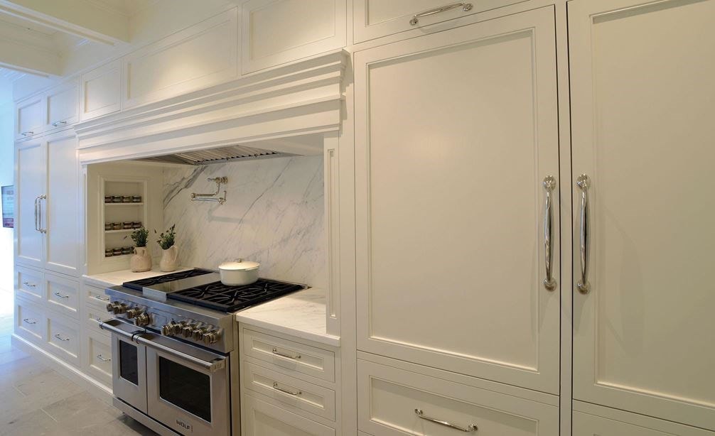
garden, and still allowed for prep space and placement of the right Sub-Zero and Wolf appliances. To keep the kitchen as classic as possible, they used white paneled, hand painted cabinetry (custom built by Fanuka Construction, who was also the contractor for the entire home) and a warm gray island that complemented the honed Calcutta marble counters and pewter limestone floors. "With direct access to the garden outside, we planted herbs and boxwoods that might almost make you feel as if you're in Notting Hill," says Bryan.
In this kitchen
Shop the products featured in this kitchen.


